 Storyville
| Research |
Synthesis |
Design |
Solution |
|
Wireframes 01
|
|
Scenario One 02
|
|
Scenario Two 03
|
Storyville: Design |
01 Wireframes |
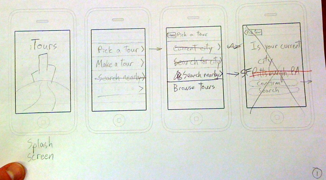
We mocked up low-fidelity wireframes on paper and iterated the design through critiques. As shown in the images below, paper prototypes are very convenient for quick editing, annotating, and iterating.
These are the first four screens of a scenario for following a tour in our initial application design. Some of our design changes can be seen in the pen & pencil markings on the page, such as cutting our main menu choices down to two and relabeling the buttons for choosing a tour.
The next four screens flesh out some of the detail for the tour selection screen. The third screen in the picture below felt a little crowded; this was one of our first indications that our app might benefit from simpler, more streamlined functionality. The first version of the audio player appears in the fourth screen.
This final set of screens illustrate a proposed design for filtering tours. We compared this list-based filtering method to other options, such as slot machine wheels or text searches. An alternate design for the audio player functionality makes an appearance in the fourth screen; we decided to drop this design in favor of a design that more closely matched the iPod app in order to be consistent with iPhone design conventions.